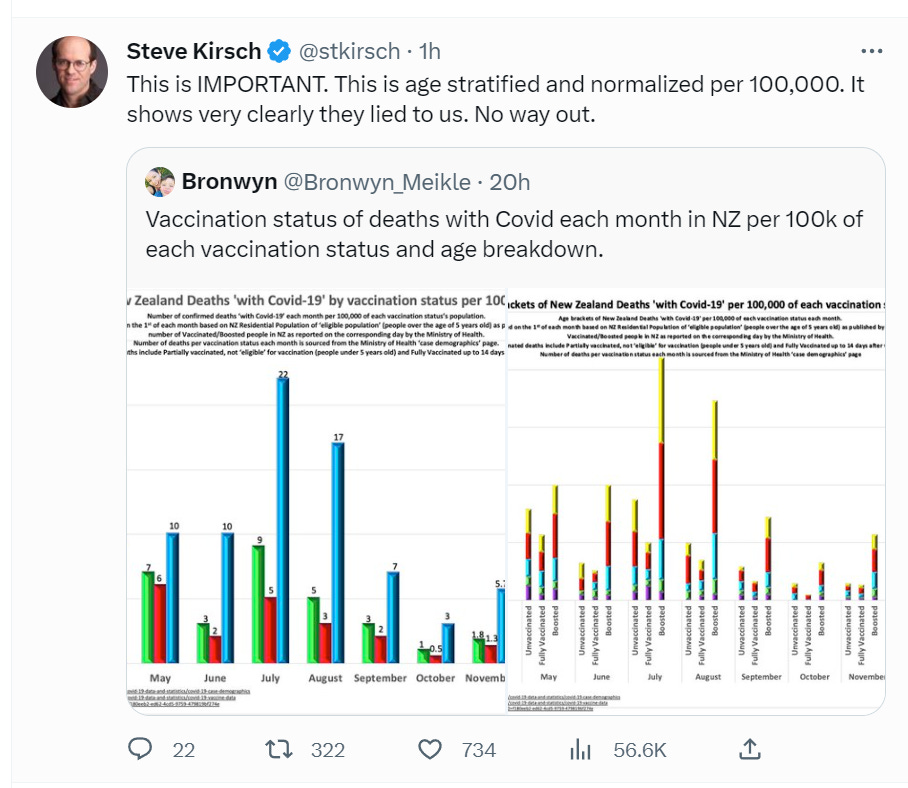
Wow. Finally crystal clear government data shows the more you vax, the more likely you are to die from COVID. This is the OPPOSITE of what the US health authorities and medical community told us.
Executive summary
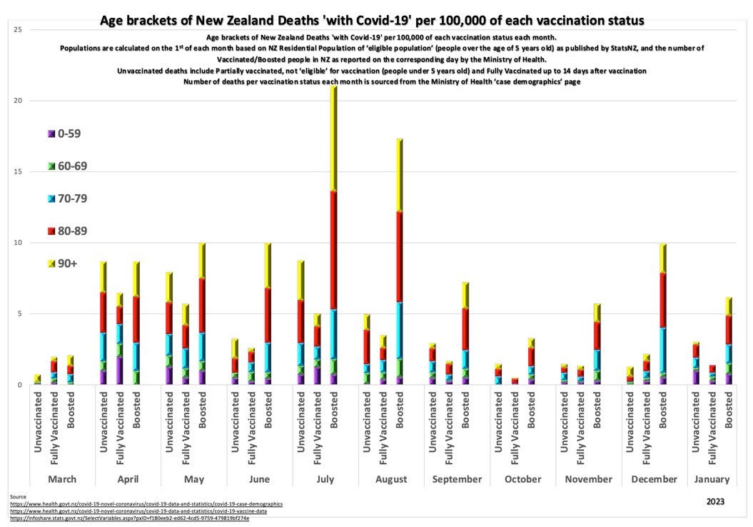
The government data from New Zealand shows that for each age group, the more you vax, the more likely you are to die from COVID.
The data shows that world governments are responsible for millions of excess deaths.
Now you know the truth.
I wasn’t lying. The New Zealand government stats aren’t lying.
The CDC and the health authorities and medical community were all lying to you about the safety of the vaccine. The vaccines are doing exactly the opposite of what they said.

That’s what happens when you give advice based upon belief instead of reality. Had they embraced full data transparency since the start of the pandemic, we could have avoided all of this. Instead, they hid the records that we needed and urged everyone, including pregnant women and kids, to get vaccinated.
Here’s a key graph in a larger size below. This is exactly the type of graph every country should be producing. But they aren’t for some reason. I wonder why?

Note
The “unvaccinated” category includes partially vaccinated, not eligible for vaccination, and fully vaccinated up to 14 days after vaccination. Had it been truly “unvaccinated” it’s pretty clear that the numbers for the unvaccinated would be even better. But there is no “cheating” once you are boosted. And you can clearly see the difference there. The numbers were supposed to go down, not up.
It’s much worse than these charts indicate
These charts basically dump cold water on the claims that the vaccines and boosters keep you from dying from COVID. They do the opposite.
What they don’t show you (because they only look at the risk of dying from COVID) is the rise in all-cause mortality and the number of people disabled and/or permanently injured from the shots. And they don’t show you the pregnancies that never happened, the 20X increase in perinatal deaths, or the dramatic drop in birth rates. So the chart shows an incomplete picture.
It turns out that the mortality and morbidity effects dwarf the negative impact on COVID deaths. But we don’t even have to go there to reject the vaccine.
The key point is that their claimed “key benefit” is not a benefit at all, but an increased risk. This makes it unconscionable for any doctor to support the vaccine.
Summary
Whoops! The misinformation spreaders were right about the COVID vaccine!
The more you vax, the more likely you are to be infected with COVID and the more likely you are to die from COVID.
But it doesn’t stop there: these vaccines also increase all-cause mortality and morbidity.
The COVID vaccines are a disaster and should be immediately halted for all age groups.
Which is what I’ve been saying since May 25, 2021 when I published my first “anti-vax” article on TrialSiteNews.
But now you have crystal clear proof from the Cleveland Clinic (COVID infections increased) and the government of New Zealand (COVID deaths increased) that I was telling the truth.
How bad is the effect? Over 600,000 Americans have been killed by the COVID vaccines in America to date. I’ll be talking about 10 different ways to get to that number in an upcoming post.


